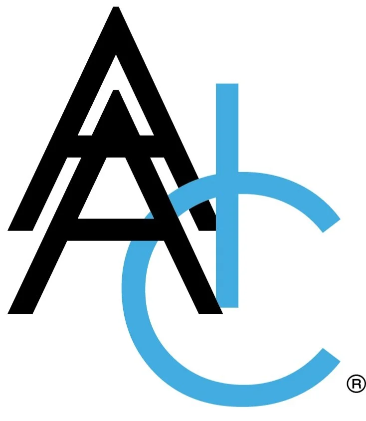
Logo Review 003: American Ag Insurance
American Agricultural Insurance Company has rebranded as American Ag with a prominent tagline of “Reinsuring Your World”. It’s a big step forward, considering where they were. The old logo looked like two Major League Baseball teams took the letter pairings off their hats and slapped one on top of the other. But, beyond the obvious aesthetics, it’s good that the rebrand is paired with a move to a more international market.
The Review
Points 1-8 from Paul Rand Logo Test Criteria - Points 9 and 10 from me.
Distinctive: No [0]
It actually looks like a pharmaceutical company to me. While a huge improvement over the sloppy logo from before, the 3/4 circle at the top is a bit random. Is it seeds? The bottom line is that it just isn’t memorable.
Visible: No [0]
Not much press around this one seeing as it’s a fairly small company.
Adaptable: Yes [1]
There’s certainly opportunity to play with the 3/4 circle in the corner and utilize abstractions for marketing materials and other unique branding opportunities.
Memorable: Yes [1]
There’s two reasons why it’s memorable. First, it is such a drastic improvement over the former logo, it is such a large shift that it stands out. Also, in an agriculture industry replete with green leaves, it’s a good idea to go in a different direction.
Universal: No [0]
It has a little too much of the generic to make an impression on a wide audience.
Timeless: No [0]
I think it utilizes a type of wordmark that many brands have moving too recently. For that reason, I don’t see much permanence to it. It’s on-trend, which can be a very good thing, but that doesn’t make it timeless.
Simple: Mostly [1 of 2]
It isn’t over the top and I remember the forms, but there’s enough detail in the 3/4 circle that I’m not sure how many individual circles there are and I’m guessing that it is a 3/4 circle.
Story: Yes [1]
The company is moving towards a more international market and the concept of reinsuring reminds clients that they are in it for the long haul.
Better Than Original: Yes [1]
This is no contest. The old logo had no regard to spacing, composition, or balance. The letters were just slapped together, seemingly to meet a deadline to have a logo go in a newspaper ad or get printed on some letterhead and business cards. The new branding is a significant improvement.


