Logo Review 002: Miami Marlins
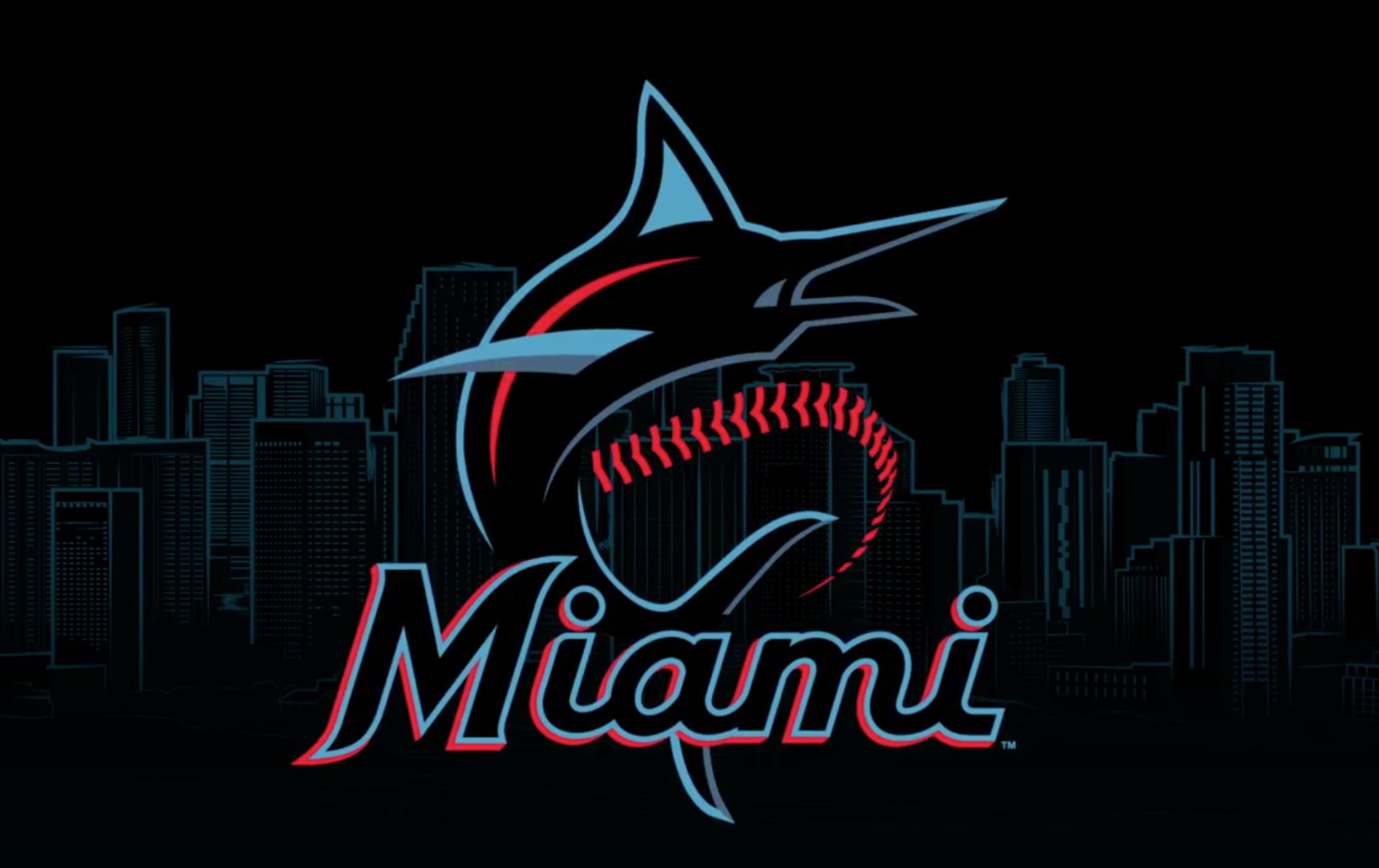
The Marlins had the big reveal of their new logo today. Branding is always tricky, but it is especially challenging to create something with enough meaning that plenty of people will likely have it tattooed on their bodies. That’s a lot of design pressure.
This version of the Marlins brand was done in 2016. The Marlins had their initial brand for almost 20 years and took it in a new direction in 2012. Since then, they have gone through a few iterations, so the club is really looking for something that will connect with the local community and stand the test of time.
The Review
Points 1-8 from Paul Rand Logo Test Criteria - Points 9 and 10 from Me
Distinctive: Yes [ 1 ]
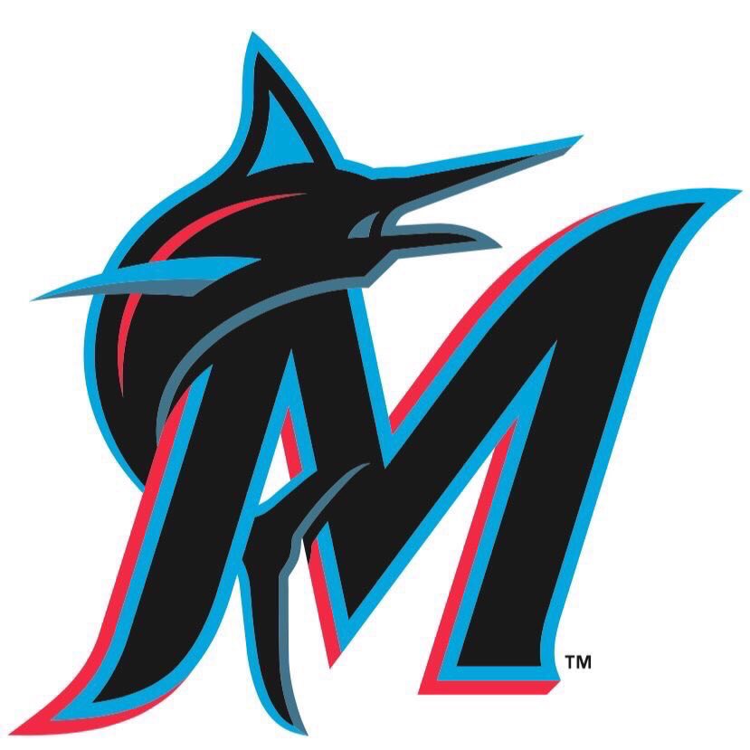
While it’s true that other teams in Major League Baseball utilize black as the primary color, this one really stands out. The combination of the light blue with black and red will provide a unique look throughout the sporting landscape and allow for some great opportunities with uniforms and merchandise.
Visible: Yes [ 1 ]
The club has already done a great job with the launch by employing local artists around the campaign #OurColores.
Adaptable: Yes [ 1 ]
I sometimes wonder if having secondary marks ready to go weakens the initial impression of a new brand, but I think the Marlins have one in place because it is common to have a third alternate away uniform during the season. I also think that the “M” strengthens the brand with its interaction with both the fins and the letterform.
Memorable: Yes [ 1 ]
I think it subtly references the original logo from 1993 and brings it forward. In that sense, it will be more memorable moving forward as well as bring back memories of the team’s early success with the old brand.
Universal: No [ 0 ]
I think it is fresh and tailored very much to the culture in Miami and South Florida. While it might be an unfair comparison, I don’t see it as having as broad an appeal as something like New York Yankee pinstripes.
Timeless: Yes [ 1 ]
I think it subtly references the original logo from 1993 and brings it forward. In that sense, it will be more memorable moving forward as well as bring back memories of the team’s early success with the old brand.
Simple: Mostly [1 of 2]
The general form of the fish and the letter is strong and easy to remember, but there is a lot of subtlety that adds complexity. Which sections are red, which are blue, which are black, and which are gray? Where exactly does the fish cross the top of the “M” and how much of the tail fin disappears into the “M”? Also, while I like the reference to the stitches of a baseball, it adds another layer of complexity. I think it’s a simple concept, but there is a great deal of nuance in the execution.
Story: Yes [ 1 ]
I think the club did a pretty good job in their video explaining how the brand is influenced and inspired by the community.
Better Than Original: Yes [ 1 ]
This is a big improvement over the most recent versions of the logo and I think it is an improvement over the original 1993 logo as well. It better represents the city and region and fits well into the American sporting landscape.


