The Pen Slide for UX
Architecture and UX
Prior to UX, I had spent my time as an architectural designer. After working on innovative design projects for organizations like Google, HP, and Stanford, I began to contemplate translating my design skills to tech. Since then, it has come to my attention that there is a growing trend of architects transitioning to the field of UX. This doesn’t surprise me. Regardless of the exact design discipline, the most successful projects are well researched and thoughtfully executed. A successful auditorium and a successful app both center around the same thing — the people that will use it.
Renzo Piano’s Parco della Musica takes its iconic shape from early sketches of how sound could travel through the room.
The parallels between architecture and UX design are many, and they are being blogged about by people like Jennifer Fraser and Melissa Mandelbaum. Jennifer did a great comparison of the two fields in 2011, and in her recent post, Melissa explored the similarities between circulation through a building and navigation through an app.
The Pen Slide
I want to share a small trick I discovered with regard to process while I was earning my Master’s of Architecture. It’s a relatively simple thing that takes minimal effort, but provides amazing results.
If you’re the same type of designer as I am, you are very concerned about the details. Obviously, that’s important in the proper context. A well developed idea should be represented as such. However, all great design comes from iteration, and the way I had always drawn reflected my inclination to focus on the specifics. I held my pen in a way that allowed me to get to an incredible level of detail in my sketches. I controlled the pen close to the page and created beautiful sketch after beautiful sketch.
Holding the pen so close to the page provides the control necessary for very detailed drawings.
The problem with constantly creating precise sketches is that it takes time, and iteration requires a designer to be agile and fluid. Ideas need to get on the page or the whiteboard as quickly as possible. Sometimes, we need to allow ourselves to generate ideas faster by doing more than just using a pen with a thicker line weight. This is when I developed the pen slide. Since my detailed inclination was to hold the pen in a tight and controlled manner, I simply slid my hand back so that I intentionally hindered my ability to control my sketching.
Grasping the pen much higher makes it almost impossible to sketch a great level of detail.
Allowing for UX Iteration
In a recent UX design project, I found myself making a similar mistake in my process. I was delving too deeply into the details before allowing myself to wrestle with the broader design concerns on the project. I then developed my pen slide for UX. Rather than devote an inordinate amount of time to digital mock-ups too early in the process, I needed a way to iterate quickly and collaboratively.
Digital mock-ups, even at low fidelity, can hinder progress if introduced to the design process too early.
So, I printed out screenshots of the app I was working on, and stuck them up on the wall in sequence. I then cut out buttons and icons from 3x5 notecards and stuck them in different locations, changed their sizes, and altered their appearance in order to rapidly generate and test new ideas. By comparison, once I utilized this technique, I flew through this stage of the project.
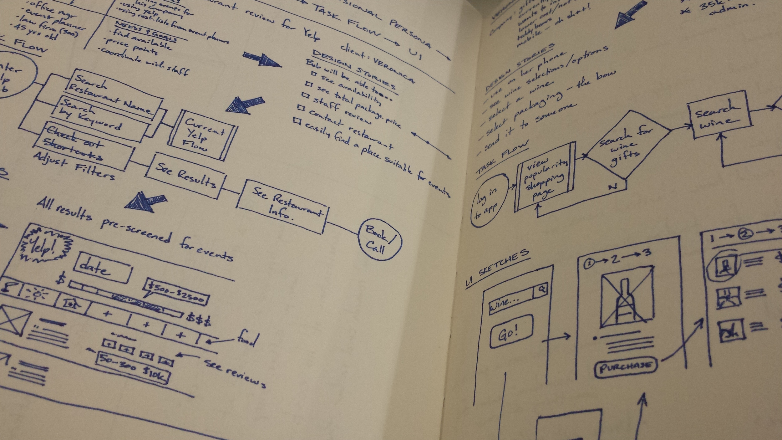
The pen slide for UX quickly led to even further development with the task flow.
Once I arrived at an appropriate solution for this stage of the design, I wrote notes all over the pages to explain the solution and briefly touched on concepts that had been attempted but were unsuccessful. This way of working also allowed for a tremendously quick redevelopment of key elements within the task flow.
In short, the pen slide for UX is my trick for getting ideas out quickly while maintaining a sense of realism. It’s easy to go low-fi and develop ideas that don’t translate well because critical restraints were ignored. This pen slide for UX is the best of both worlds. It takes the current constraints into account while allowing for loose iteration.


