UX at Dreamforce
I had been told that Dreamforce is an incredible event that was well worth my time. I opted to check it out and I have to say, there was a lot going on.
Naturally, I started my afternoon getting a wonderful lunch courtesy of Domo. Thanks guys.
I then played a little game of find the Porsche.
Inside, it was slightly less chaotic. Lots of junior sales people were exceedingly persistent in attempting to offer me free popcorn. I was able to meet a number of UX colleagues from companies like Facialnetwork.com and Tact. We discussed everything from overcoming user hesitancy with innovative technologies to dynamic interactions with something as simple as a contact list. It was great to engage in stimulating design conversations in the midst of the exhibition space.
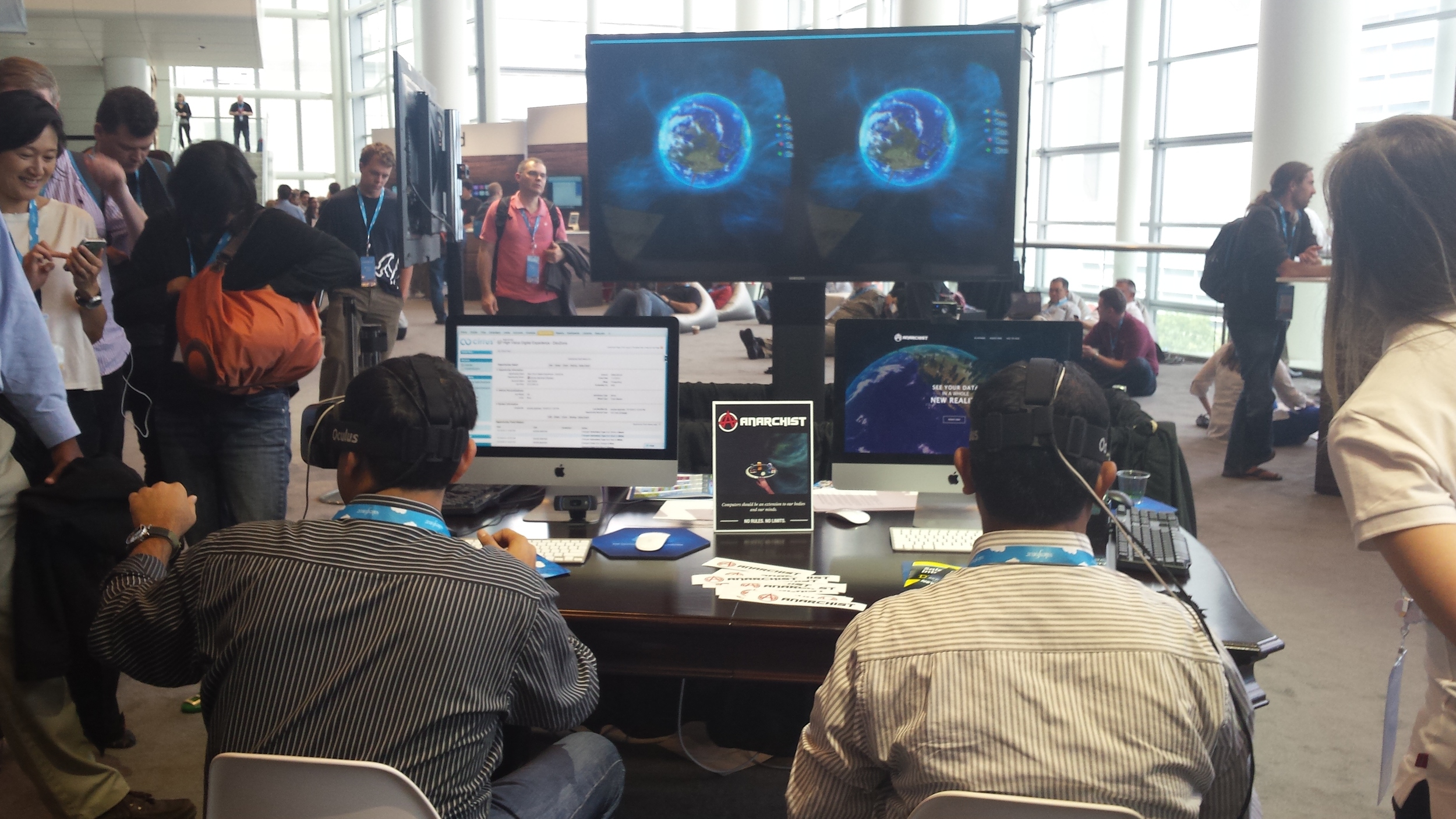
Of course, there were plenty of interesting exhibits such as this Oculus demo.
The UX team at Salesforce put together a great experience with their Internet of Things shopping experience. Dreamforce attendees could input their names, shirt sizes, and desired colors on a tablet and then pick up canisters that would show the different shirt designs on a screen. Multiple canisters could even be selected simultaneously in order to let different designs be compared. Then, a participant could scan the Dreamforce badge over the reader while holding the desired design and collect the selected design at the next station. It was a great interactive experience.
I have to give Desk a nod for the best design of exhibition space. Their bar themed environment was a welcoming experience. I almost walked up to see if I could get something to drink. Talk about encouraging people to approach and start a discussion.
And what Dreamforce experience could be complete without the Incredible Hulk?


